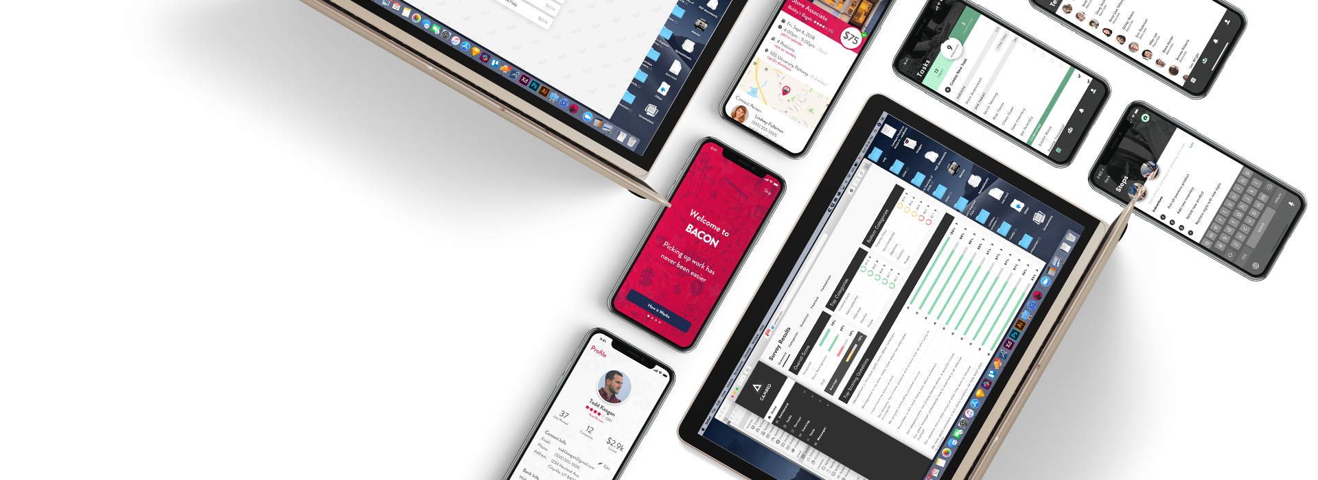
As this product was preparing to go out of beta, three user frustrations were identified as potential areas of improvement for the next iteration. First, the process required to create “paths” to monitor was difficult and required special training. Second, users were required to log in to the system before they gained any benefit from it. Third, there was a lack of specific and actionable data.
Product Management:
Work with customers and CSMs to identify needs and weigh options against business goals
Establish road map for progress
Consult with stake holders to determine ultimate direction for project
UX Design:
Ideate and create mockups and prototypes for potential solutions
Conduct usability testing
Iterate and refine designs based on feedback from users, devs, and PM
My Product Manager had conducted fairly extensive research prior to me coming on board. As such, many of the requirements and user goals and motivations were already defined.
Still, as with any good UX, I sought out to develop empathy. I talked with people within the company who worked the most closely with customers and users, and while it was unfortunate that I did not have direct access to customers due to time and budget constraints, I was able to start to understand the frustrations and goals that customers had when dealing with the product.
It was through this interaction that I discovered that much of the implementation was done by an in-house team, and I was able to contact them and have them explain the implementation process.
Through user research and direction from my Product Manager, we identified Jobs-To-Be-Done to guide the ideation and design process.
Simplify Implementation:
When implementing a new “path”, I want to be able to simply record page interactions using common tools, so that I can create a “path” without special training or knowledge
Before saving a path, I want to be able to add additional interactions, so that I can customize or add more advanced interactions as needed
Real-Time Notification:
When there are actionable items, I want to be notified with enough relevant information, so I can decide whether to act on it
When configuring my “path”, I want to be able to choose when I’ll receive a notification, so I can avoid “noise”
When an actionable item is discovered, I want to be informed in a timely manner, so I can troubleshoot the problem
At any time, I want to be able to adjust my frequency and notification settings, so that I can avoid “noise”
Specific Details
When viewing a “path”, I want to be able to see what the size of each page is, so that I can quickly see if one particular page is larger than another
When viewing a “path”, I want to be able to see what the page’s latency is, so that I can monitor for potential trouble in a user’s experience
When viewing a “path”, I want to be able to see what portion of my page size is made up of third party technologies, so that I can be aware of the impact my total technology stack has in relation to page performance and user experience
First, in working with three potential improvements to the product, we had to decide how each of these might work and what was involved in making these solutions.
Simplified Implementation
Match implementation method to user’s mental model
Remove unnecessary complexity
“Record” user input
Real-Time Notification
Email notification
How often? What level of detail?
Notification through browser extension
Specific Page Level Detail
What is a “Page”?
What information is necessary?
Using a design system allowed me to quickly move from user flows and sketches to high fidelity mockups, and because the design language was already established, early mockups and prototypes were focused on conforming to those constraints.
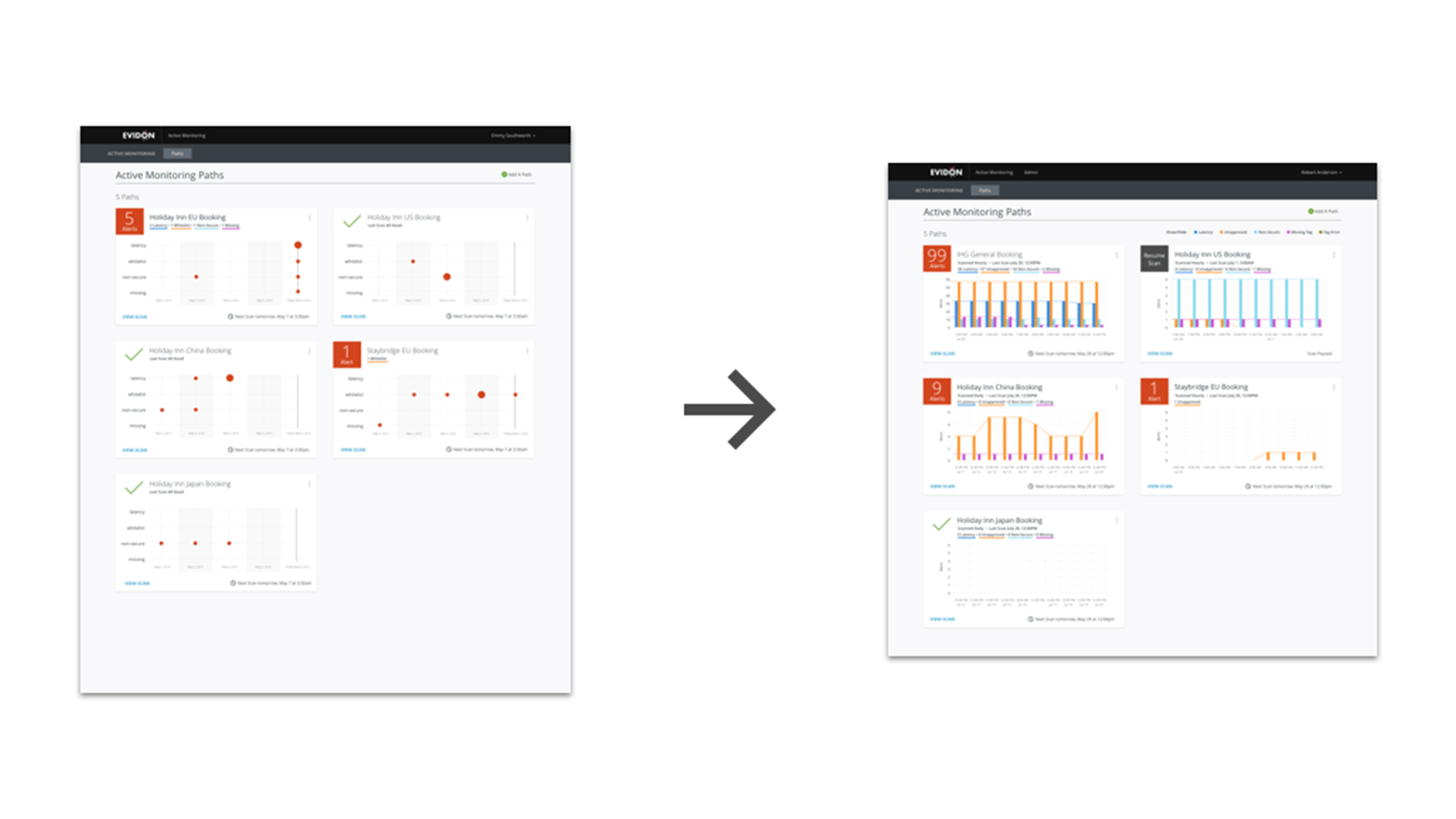
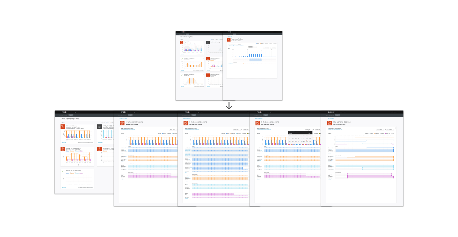
The project also included updating the current dashboard to display more context into each path. This included a historical overview of the issues that occurred and the ability to choose a date range to view.
Usability testing initially started with showing prototypes to Product Managers and others around the office. Doing this allowed me to identify common usability issues quickly, and required very little resources to complete. The next step required setting up remote tests using Validately to reach outside users and customer support managers who were also using the product in behalf of their clients.
These test revealed gaps between the current implementation and the direction that we were looking to take the product that would need to be filled to ensure smooth transition. After discussion with my Product Manager, he decided that while some training would be required to fully onboard users, that it was minimal enough to not prevent adoption.
Each concept had strengths and weaknesses, and tailoring them to fit the needs of the user required many iterations. As such, each concept, while collectively aimed at enhancing the usability and productivity of the product, took on their own character.
In trying to match the mental model of users, we chose to focus on the concept of “recording” user interactions. Previously, the method for “programming” a “path” required implementers to understand how the system worked and also required a certain amount of programming experience. The goal was to design a solution so that anyone who could navigate a website could implement a simple path, but also allow enough customization for power users to create more advanced interactions. The result was a “screen recorder-like” browser add-on similar to web automation systems.
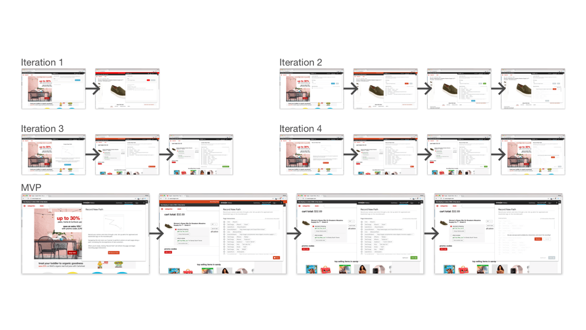
Working with developers to understand the feasibility of such a product revealed that, while technically possible, this kind of solution was outside the specialty of those that were currently employed, and would required substantial resources to implement. So, despite very positive feedback from users, this solution was pushed to the backlog as a potential for future versions.
A large concern about the product was that there wasn’t enough information to direct a course of action. While it gave users a snapshot of the technology implemented within their site, it didn’t give much in the way of context. Questions arose about where issues occurred, how long has this been an issue, etc.
Our solution to this was to give insight into each step in the interaction path and give relevant data as to how the technology implemented was affecting the site’s performance at each step.
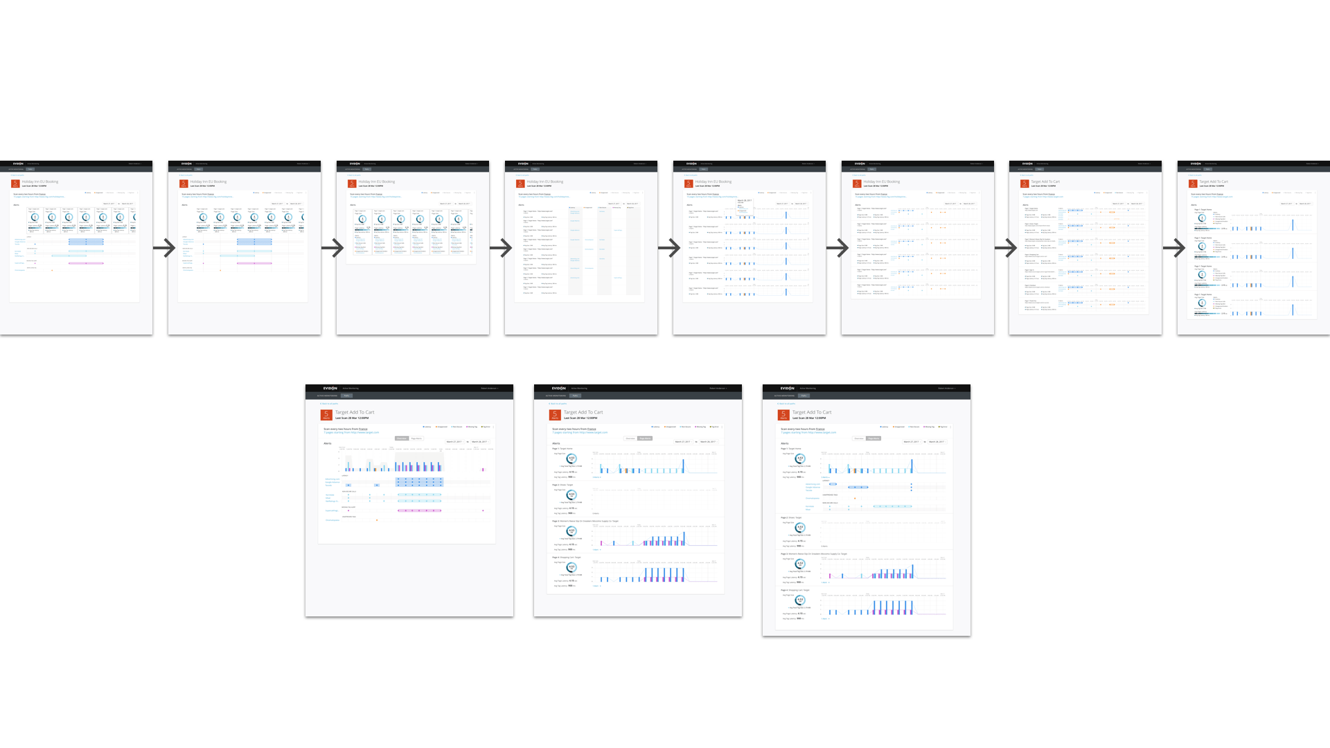
In testing and discussions with developers, there was some ambiguity as to what a “page” or step was along the path. Additionally, the system didn’t have a way to differentiate different steps, this functionality would need to be built. Despite this, having the additional insight was considered a point of emphasis in testing and reviews with stakeholders. So resources were allotted to define the concept of a page, and examine what would be required to implement this into our system.
Research discovered that although users were implementing the product, there was little interaction with it afterward. Many times, customer support managers would use the product to create reports for their clients. While this seemed to work initially, there was a large delay between when issues occurred and when action would be taken.
As we examined what would be required to provide as close to real time data as possible, we discovered that another product had similar functionality, and there was a chance that much of that code could be reused for this purpose.
As with any notification system, there are sensitive areas that need to be addressed, such as frequency of contact, and depth of engagement. To these issues we decided to start conservatively with summary reports that acted as a touchpoint to bring users into the product, rather than trying to use email notifications as a true real-time notification system.
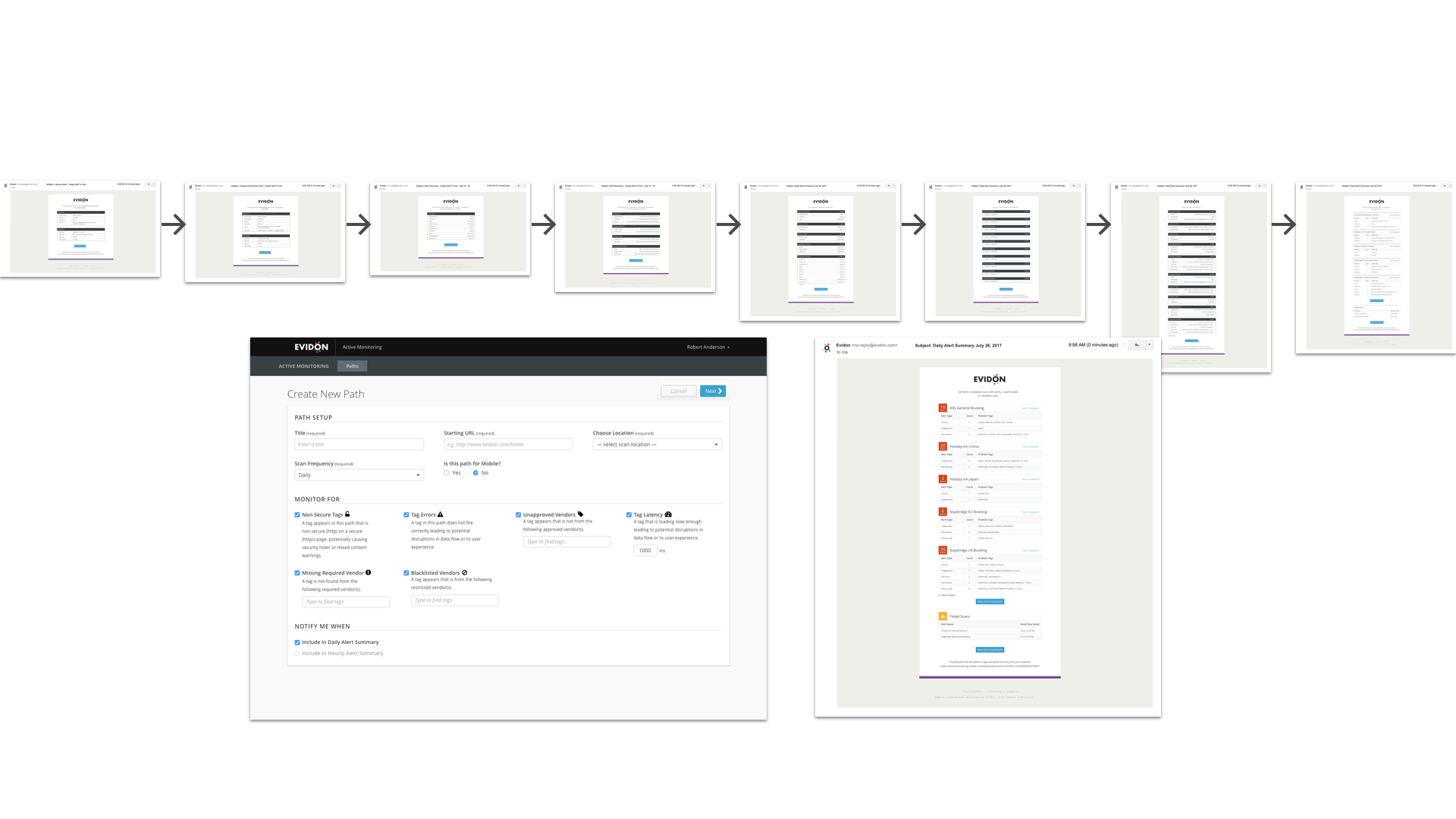
As we pursued this concept, stakeholders informed us that this was to be the highest priority as it was rapidly becoming the most requested feature. In addition to being the most requested feature, it would also be the simplest to implement.
In hindsight, it may have been obvious what needed to be included in the next version, but going through the process of ideating and designing the different concepts proved to be quite fruitful. Not only were we able to discover the next version, but also fill the backlog with mostly complete ideas for future iterations.